This project is a sample of work for my portfolio. All content was developed by James Mackay.
Developing a responsive quiz-taking app with enhanced user experience
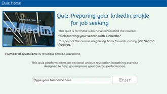
"Preparing your LinkedIn profile
for job seeking"
Portfolio
Overview
Details
Type: <ul
Online Assessment</ul
Date: July 2023
Tools
Articulate Storyline 360
DaVinci Resolve
VScode
Adobe XD + Figma
Skills
Online Assessment + Feedback
javaScript Programming
User Experience (UX)
Film editing + Annimation
Accessibility
TL;DR
Born from a coursework piece for the Google UX course. I created a LinkedIn course assessment tool. The tool has three key parts:
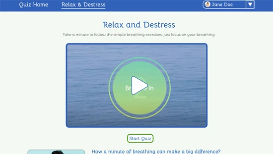
A relaxation and destress section. A simple breathing exercise designed to help users who get stressed by tests and exams.
The quiz taking section. Emphasis on easy to use and clear navigation. The aim is to help the User maximise their potential.
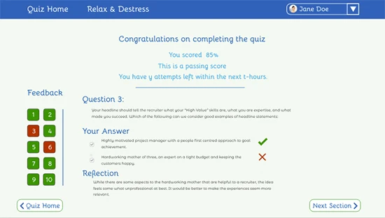
Finally, scoring and feedback section. Using a human centred design approach to make it easier for the user to access feedback. Finally, for those who passed with 60% or more, they are awarded a downloadable certificate.
To create a fully functional standalone quiz taking app. The app should be easy to use and meet user expectations to improve the quiz taking experience.
Background to Project
“Creating a responsive quiz taking app”. This was a project I began while completing the Google UX Certificate run via Coursera.
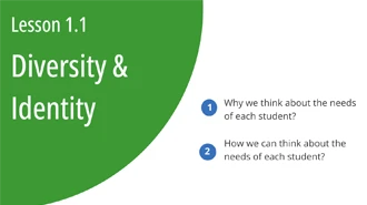
Creating a full backstory for a company that was training Job Seekers to help them find work. The purpose of the project was to create a responsive quiz taking app. The app would be used to assess users understanding of the ‘using LinkedIn as a job hunter’ course. After conducting user research, the following goals were set for the project:
Help reduce user stress and anxiety they suffered from when taking tests.
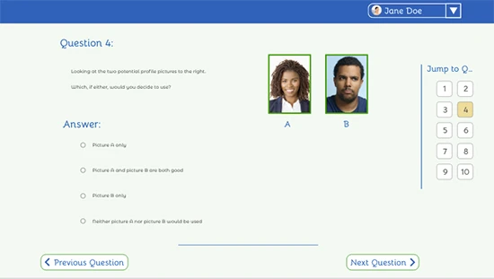
Navigation – easy movement between all questions within the quiz. Users wanted to see what they’d already answered, and what they still needed to answer.
Feedback – was an important consideration to users. They wanted meaningful feedback that helped them overcome mistakes. It didn’t necessarily have to give them the correct answer.
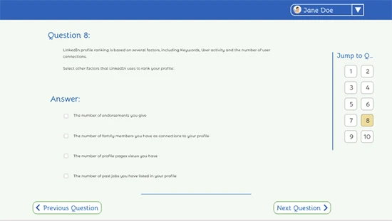
I created a complete prototype and mock-up originally in Adobe XD. The quiz consisted of 10 multiple choice questions. Seven questions were single option answers and three were multi-option answers.
Moving from prototype to actual working model is the focus of this write up.
Development
Building out the Solution
The Analysis of the situation
Starting for the position of a working prototype, the user brief was already covered.
The planned questions, solutions and feedback had already been prepared.
The colour scheme and theme had also been set out by the earlier work completed.
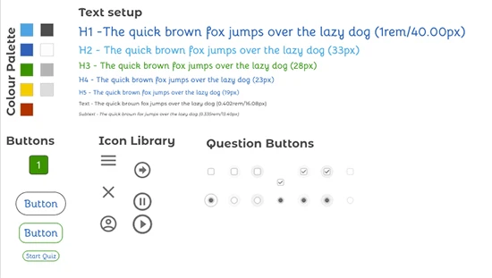
Style Guide
Relax and De-stress section
Single answer question
Select Mulitple Options
Results and Feedback
Challenges in Production
Video Production
Problem: Create a breathing exercise video. This should help users reduce stress and anxiety about taking a quiz.
Solution: The first problem of a breathing exercise video was quickly overcome. I created a simple compilation using DaVinci Resolve. Combining a short video, with a suitable soundtrack built the foundations. Applying instructions via animation to help the user with breathing with Davinci Resolve.
Navigation System
Problem: An easy-to-use navigation system, that replicated the designs from the prototype. Supplying visual cues to users about which questions: had been viewed; had been answered; and still needed to be answered. Transposing this in to Articulate Storyline was the challenge.
Solution: Quiz navigation. A simple effective solution that needed many triggers. The triggers updated a series of button states. The states represented: “Unseen questions,” “Seen but unanswered questions,” “Answered questions.” These three states were set according to the user’s interaction with the questions. The user is able to navigate using these buttons or via the next and previous question buttons. The aim is to make navigation as easy as possible.
Feedback - with multichoice answers
Problem: Feedback should only work with the user’s answers. The ultimate challenge here was on the multi-choice questions. Four potential answers, and four potential feedback. The standard Articulate Storyline interface meant potentially large gaps between questions/Feedback pairs. I wanted to only display the user’s answer and the specific feedback for those answers. I wanted the answer/feedback combo to be presented one after the other. So, if they selected options 1 and 3, only show those two without space between.
Solution: This proved a far more challenging problem. Avoiding empty space and long scrolling to see a solution and feedback. For the single option answers there was no problem at all. The problem with the multiple solution questions 3, 5 and 8. The user can select between one and four options. This is where JavaScript came into play and began to takeover.
To solve this problem, I use a simple function to generate feedback. Using the users input answers, the function prepared statements with answer and feedback. The statements were then pushed to variables in Storyline. The variables would only be displayed if they had a value. So, if a user selected option 2 and 3, then the answer and feedback would be pushed out the variables 1 and 2. This method eliminated the gaps that would have existed using just storyline.
Without using JavaScript
With Using JavaScript
The solution was simple and elegant, so I decided to implement it for all questions. I also pushed the score calculations out the JavaScript. This greatly reduced both the number and complexity of the triggers I used in Storyline.
How I used JavaScript
Split a full name variable in to a first name and last name variables. This allowed me to talk on a more personal level to the user, just using their first name. However, it also allowed me to be more professional with results and certification.
Calculating the score at the end of the quiz. This replaced 22 triggers with a single trigger on the confirm exit layer. A few extra lines of code also made the feedback navigation much easier to put in place. Again, replacing multiple triggers, a single trigger.
Before JavaScript
Letting JavaScript do the work
I defined the feedback in JavaScript and pushed to storyline based on user’s answers. This helped reduce the visual complexity of the slides.
Using jsPDF with JavaScript I was able to generate a “Certificate of Achievement”. The certificate pulled the full name and percentage score from Storyline variables. This created a personalised reminder of the achievement that was easy to share.
Finally, a limit of Storyline is reset of variables. A few more lines of JavaScript I was able to reset all variables back to default. I left the name, and previous score variables untouched. This meant the user could skip straight into the quiz without going from the very beginning. It also gave them a measure of how much they had improved on the second attempt.
While Storyline can be very powerful, adding JavaScript can make life easier. JavaScript turns storyline complex calculations into very simple operations.
Online Assessment Development
Articulate Storyline 360
Adobe Illustrator
Figma
Inkscape
The Project
How well do you know LinkedIn and how to optimize your profile. Feel free to have a go on your own. The answer key is supplied below, and you can hover over at any time to reveal an answer.
If you want a certificate you need to score more than 60%.
Given the power of JavaScript, it wouldn’t take much to randomise the order of options for a question. It is not much of an extension to begin randomising question order too. This will need careful consideration for usability and accessibility for the students.
Using JavaScript to calculate the score, opens the door to an alternative scoring approach. One such option is the User Confidence indicator. At the end of each question, a user is asked to rate their confidence from ‘very confident’, via ‘ok’, to ‘not confident at all’. A user can only reach 100% by being very confident and having the correct answer to all questions. This system can result in negative marking if a user is too confident but does not get the correct solution. Thus, rewarding those who are prepared and willing to be confident.
Like what you see? Let's Connect
The ideas discussed above were outside of the original project and design. However, they offer an idea of how we could work together on your next project. Helping you to achieve a more meaningful assessment tool for your learners.